- Life Coaching
- Marketing
- Website Mistakes
15 Website Mistakes To Avoid On Your Life Coaching Website
By: Paul Buckingham
Page Summary
Making website mistakes can be both costly and demoralising for coaches. These 14 common and no so common mistakes by contributor Paul Buckingham will provide a powerful guideline for the care you need to take in creating and maintaining a life coaching website that works for you. Plus Wendy's real life case study of a mistakes disaster.
Quick Links
I may receive commissions at no cost to you. I participate in the Amazon Services LLC Associates Program. More...
The No.1 Biggest Website Mistake - Not Enough Research
All too often that I hear a tail of website woe that may start with something like:
"My friend's website designer did a good job on and it looks really good, so I asked him/her to design my site!"
That can be the first and often biggest website mistake! Simply commissioning a designer to build your site or even just choosing one of the heavily marketed DIY brands that promise low cost instant websites like Squarespace, Wix, Weebly or GoDaddy is not the best place to start. There is a big step before that.

For instance, you wouldn’t go to a builder and just say, “I want you to build me a house?”
You’d list the features you wanted, look at other houses with similar features and have plans drawn to make sure you were getting what you need. You would also make sure that the foundations were strong and that all the nuts and bolts were in the right place so everything worked.
The same principle applies to creating your life coaching website so that it actually does the job you want it to do. So before you even talk to a website person or investigate a website platform, get clear on what you want your website to do (inform and attract potential clients), and the functions you need it to have to do this.
It is huge mistake to just say to a website designer “I want you to build my life coaching website” without a detailed brief of what you need. This is because although they may be very good at design and building, they may know little about user-friendly site structure, SEO (search engine optimisation) or the many other factors that make sure your site will be easy to navigate and actually found and engage visitors. Conversely they may be very good at SEO but light on design skills.
If you are not sure on what you need from your website, browse other good life coaching websites to see what works and what doesn't in the way of information, layout and navigation.

14 More Common Life Coaching Website Mistakes
Getting all your ducks in the right row with your website is quite a challenge. There are so many things to consider. Here are 14 more easily made and often overlooked things that can make all the difference to the viability of your coaching website.
1. Facts not assumptions
Because platforms such as GoDaddy, Squarespace, Wix and Weebly advertise so heavily and have such a low cost entry level, life coaches often assume they are good platforms for a website promoting their business. The assumption is that once launched your website will easily be found by someone looking for your services. Unfortunately it's just not the case.
While these platforms, in the main, are certainly stable and reliable, they may not adequately support you with the necessary quality education or provide the tools you need to include if you want to ensure a strong online profile that attracts clients.
2. Watch out for those hidden costs
Common marketing lines such as 'Build Your Business Website In 15 minutes" or Get Online For Free" and other similar phrases are attractive. But they generally mean that there will be hidden expenses and a lot more work than you had bargained for to make the site an efficient marketing tool for your coaching.
This is why you need to be really clear on what you need your website to do for you and what these "instant" and "free" platforms offer and do not offer for no or low cost before you use decide to use one of them.
3. The problem with slideshows
One of the top website design mistakes is the use of slideshows on the home page showcasing your testimonials or some other feature of your coaching. These are often promoted by web designers as an attractive feature. They maybe look good but actually waste an awful amount of space, slow down your site speed (very important) and almost no-one clicks on them.
A SearchEngineLand study way back in 2013, discovered that only two thirds of one percent (0.65) of visitors clicked on the slideshow. Nothing has changed. They do nothing for your visitor or your site getting found by the search engines.
4. Your website loads at snails pace
If you site loads really slowly your visitors may get impatient and click away. There can be any number of reasons for slow loading from oversized images to technically inefficient platforms. Whatever the reason, it affects the way Google and the other search engines rank your page so you need to find out why this is happening. Google has a very handy Page Speed Tester which will give you a good idea of how fast your site is loading.
5. Poor hard to read typeface is a turnoff
Can you read this? Maybe you can. How about this?
Can you read this now?If you can, imagine a whole page of it.
The problem is that, even though you may be able to read text because you have
1) great eyesight
2) you are using a large desktop screen.
3). you are reading the page in good light,
there are many - quite likely within your audience - who may have poorer eyesight and this can effect their experience of your site.
So the issues are:
- Font size is too small
- Font maybe large but is too fancy.
- Font has a non-contrasting background. (Font has a non contrasting background!)
I'm not saying that you should not use nice fonts with a coloured background. Just do it judiciously and make sure it is easily readable, not just by you. Get some feedback.
6. Make sure your website colours work
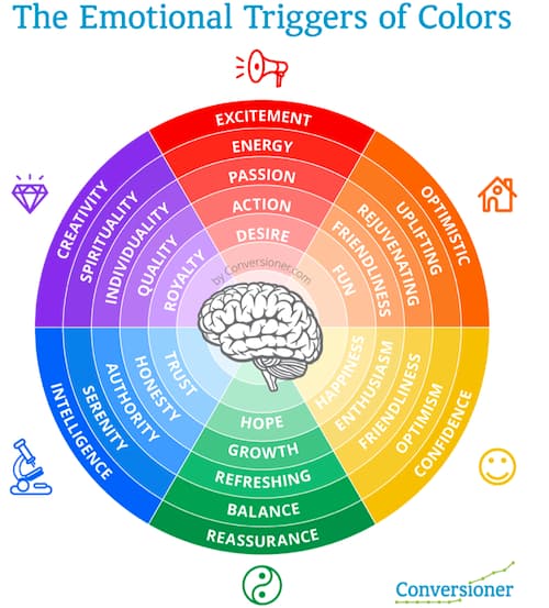
This image is part of an excellent article by Conversioner.com about the emotional impact of website colours. You'll notice there is nothing very dark or dull, which is a common website mistake. Choose colours that reflect the essence of your coaching.
7. The pictures are too "heavy".
I've already talked about the impact on SEO of large slideshows and how they can slow the site down. The same applies to static pictures. This doesn't mean that you can't have judicially placed images throughout a site. However you want to make sure they are as light in weight (that is the information the picture file contains) as possible before you upload them.
This means using a free function such as Googles' Squoosh to lighten the weight of the picture before you upload it to your site.
8. Don't forget those who require visual or other aids to read your site.
Take the time to add descriptive information to your images (called Alt Text) because those who are sight impaired and using a computer voice to read your content will need it. If you don't know how this works, your website support service will.
An excellent resource for understanding this area of accessibility is the work of the Web Accessibility Initiative, part of the World Wide Web Consortium.
The principles apply to anyone but if your coaching niche is specifically related to those who are physically impaired in some way, then this video from the same group is a wonderful introduction to all you can be doing.

9. It's not ALL about you...
If there was one over-riding issue for life coaching websites it is that the content is too much about the coach - not the reader.
The visitor has visited your site out of curiosity about you (of course) but what they REALLY want to know is that you understand their issue in general terms and that you show you can help them. Once they get that, they are far more likely to take the step to book a Discovery Session with you.
So make sure your content, especially your home page, describes who you can help and how you can help them with your coaching.
Kenn Schroder's handy guide for websites for coaches
10. Use original images
How many times do you see coaching websites that have the same or similar pictures from a another website or picture library. Stand out and look original by taking your own, creating your own or paying for some pictures that are just a little different.
Canva for example allows you to pay just US$1 for a picture and they also have many excellent items that are free. You can crop and/or add your own wording making the picture really original.
Equally, Unspalsh.com has a a wide range of free images which are well worth looking at.
11. Legalities and protection
These are significant hidden traps that can affect your website.
One of the most significant privacy laws to come into place in the last few years is called the General Data Protection Regulation (GDPR). Basically it requires site owners to ensure that visitors know what they are asking for when they give away their email addresses. Even though this was European focussed it affects everyone because your visitors may either be in Europe or a Euro citizen.
Here' a brief outline of what you need to be compliant, and avoid a this website mistake. It applies if you are asking visitors for their email address for any reason but it also affects your relationship with Google.
- You must have a way for visitors to consent to your collection of their data. And this must be an opt-in by default, not an opt-out. It must also have a link to your privacy policy (which is also required).
- Your privacy policy must outline all the ways that you collect personal information, and what you do with it. It must also outline how they can view, change, download and/or delete their data.
- Each form you have on your site must tell users what their data will be used for (e.g., receiving a 7-part e-course or a monthly newsletter).
- Each form must give them a way to review your privacy policy.
12. Don't ignore the importance of meeting Google needs
Because Google seems to dominate our daily internet life it's hard to imagine that we could ignore it. Yet many website owners do not give Google enough attention. This is why many websites get almost no visitor traffic without investing in advertising.
Ignoring GDPR, (Tip 11), having a slow website, having content that is hard to read or with a file name not relevant to your intended visitor are all reasons why your website will not fair well in the search engines and you will not be easily found. Take the time to understand and impliment what Google needs and it will transform the way your site gets found by your potential clients.
13. Not regularly checking links can be diasterous
If a link on a site I am visiting doesn’t work and I have the time, I email the owner of the site and let them know “link not working”. However, not many people do that and just move on disappointed, never to return!
So regularly check that all your website and newsletter links are working is one website mistake that can easily be avoided. There are automatic programs that will check for you and notify you of a broken link BrokenLinkChecker is free reputable and reliable.
14. Help your website attract traffic
Many coaches will have a website but it attracts few visitors so they have a low online presence. This article will show you many ways you can rectify that. Created by SiteSell, the website system we use, it covers 23 ways to earn free traffic for your website and many don't even involve Google!
Wendy Buckingham's True Story Of A Client's Website Disaster
My client Lexie, (not her real name) a high school English teacher, had a wonderful idea for an online business. It actually inspired me! She was setting up a an online facility for teaching English to Japanese and other Asian students.
She knew there was a demand for this and saw this business niche as a way to get out of face-to-face teaching, which she was not enjoying, and to provide for her into retirement
Unfortunately, by the time she came to me to coach her through the process, she had already commissioned the website to a local designer.
One of the first things I asked Lexie was “is your designer able to handle the SEO (search engine optimisation) component of the website?”
Despite my prompts, and emphasising the importance of a website for an online business being functional, engaging and easily found - as well as looking good - her answer was vague.
She also didn’t want me to see the website until it was finished so I had no option but to go along with that even though I could foresee some big website mistakes.
Lexie was wonderfully proactive in the other aspects of setting up her online business. She created a really snazzy logo, sourced and engaged suitable teachers to take the flood of enquiries she was expecting when the website was launched. All the systems and schedules were in place and she had asked the designer to set her up a a booking system for eager Asian students.
During our coaching sessions, however, Lexie did admit she had some issues with the designer not doing what she asked, did not have the right idea about the visitor experience and putting in stuff she hadn’t asked for. We had several conversations to help her resolve this but she still insisted staying with the designer was her best option.
A Website Can Cost $1000s And Still Be A Disaster
I would add that this website was not a “cheapy” no frills website such as Wix or Weeby, but was costing her thousands of dollars to have built. The designer had also locked Lexie into a plan where there were costs for every change made to the content.
Just before launch date I got to see the website. It was visually quite impressive, with huge moving pictures and lots of gimmicks. It looked good - but apart from not having the SEO keyword components to enable it to be found, it had scrappy content, didn't engage the visitor, was hard to navigate and had no real call to action.
I knew she was heading for a website disaster and there was nothing I could do to help her.

So launch day for the website came with much anticipation.
Two weeks later Lexie is on the phone in a panic - the anticipated flood of enquiries and bookings had not come - not one.
Despite my warnings, she had been convinced that in the words from the film Field of Dreams “If you build it they will come”. They hadn’t!
Also Lexie and the designer had overlooked the fact that it needed to have a translation facility so its could be read in Japanese and other Asian languages - her target market.
Lexie regretfully realised, her expensive website simply had not been designed or built to do the job of an online business.
There was nothing else to do but for Lexie to extricate herself from her website designer and more or less start again. It set back the launch of her her new online business months at considerable cost to her both financially and emotionally.
This story is not unique. I often hear similar sad and frustrated tales from coaches who have built a good looking website that simply doesn’t do the job of helping create a profitable coaching practice because of some of the website mistakes I have mentioned.

Related Pages
Outsourcing Marketing For Your Life Coaching Business
How to go about outsourcing marketing for your life coaching business. The benefits, the traps to avoid and choosing the right outsourcing partner
Guest Blogging Guidelines for Life Coaches
These guest blogging guidelines will make sure your articles and comments will attract attention and engage possible clients
A guide to building life coaching websites that will attract clients
A guide to building life coaching websites that will attract and engage prospective clients to have you as their coach


